Our work
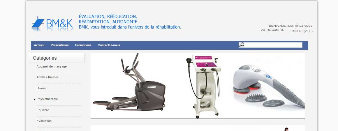
BM&K
Evaluation, Rehabilitation, Rehabilitation, Autonomy
A new challenge for Novatis that has been solicited by BM & K for the design of their website. A motivating challenge given the diversity of the product range. A category menu on the left to choose the family of items. The colors chosen for the site were inspired by the logo. Not to mention the search bar for faster and easier navigation.Technica Engineering
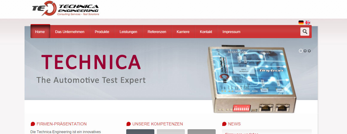
Pioneers of Automotive ETH
The young emerging German company entrusted us with the realization of its website in two languages: English and German. The idea was to discover the services of the company and put its expertise forward. While strolling on the site, one notices the strength of the red color which makes reminder to the logo of the company. The graphic and ergonomic design allows to put the news and the news first.SKF Agence
A site like no other: mission accomplished! The Novatis singled SFK site project is unique in its design and […]
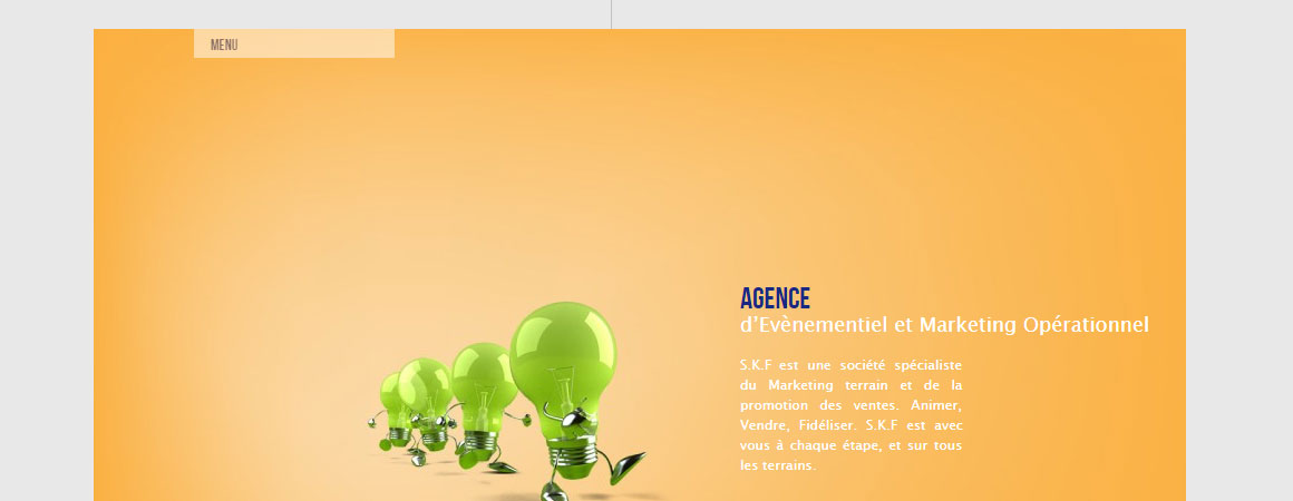
A site like no other: mission accomplished! The Novatis singled SFK site project is unique in its design and architecture. In a context centered on changing funds, the site opens with a small presentation on the right. A vertical menu on the left to discover the content of the site. As they say, simplicity is beauty.Speed 4 All
In 3 living languages and in a frame with a gray outline, the site speed 4 all is realized […]
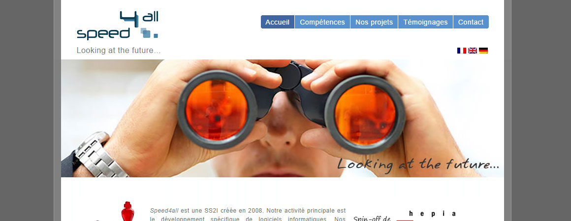
In 3 living languages and in a frame with a gray outline, the site speed 4 all is realized by Novatis presents itself as portal of information on the main activity of the agency. A menu at the top right and clear content. An architecture that facilitates navigation and makes reading a more peaceful experience.Kallel & Associates
The experts at Kallel & Associates law office
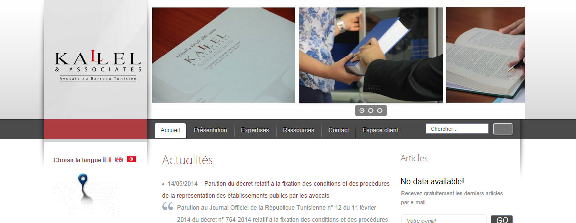
The experts at Kallel Law Firm & amp; Associates put their trust in Novatis for the development of their website. The purpose was to present the expertise of the professional company and to discover the visitors expertise of this company of lawyers. A customer area is also added to the menu to make the visit to this site more efficient.Kolo
A real online catalog attractive and modern. The e-commerce site of the brand Kolo is a visual support of […]
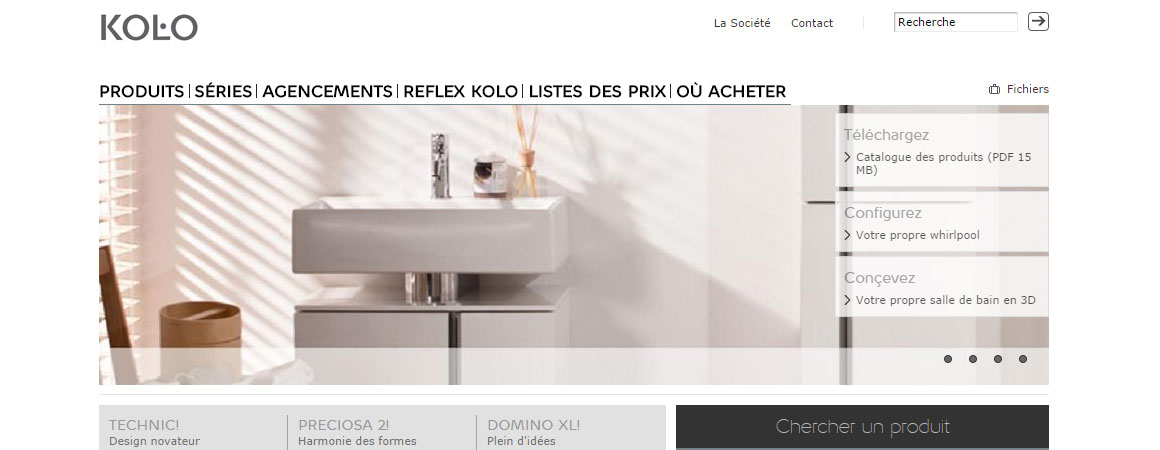
A real online catalog attractive and modern. The e-commerce site of the brand Kolo is a visual support of choice. Photos that scroll horizontally in a slide shape gives an interactive atmosphere to the site. The diversity of the catalogs has been taken into account in the graphical architecture of the site.Mondial Fret
multimodal transport, international carrier
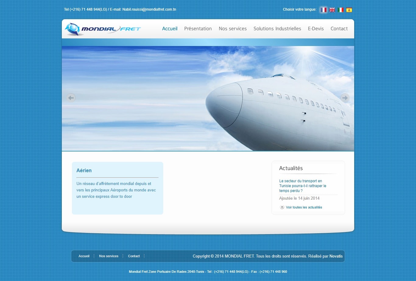
The Mondial Fret site, the international transport company has a multitude of services to offer. The idea was to present solutions for customers and allow them to better know the history of the company and to request an online quote with a simple click and without wasting time. The choice of the blue color was on purpose to make reminder to the logo.

Need to get an idea about our work ?

